You went to all that effort making content for your blog and website, you probably want people to be able to find it. Implementing SEO helps take care of bringing traffic from organic search (you got people from Google to your site, that’s a win!). But once the visitor is on your site, how easy is it for them to find other content? If they want to keep digging through your site, you certainly don’t want to get in the way of their search. This is why you want a great search experience on your WordPress site.
‘Discoverability’ is an integral part of a website’s or app’s UX, but it can have a huge impact on the overall digital experience that a brand provides to users. The friction that can immediately be caused by not providing a user-friendly search experience can increase bounce rates and lower the average session time and the likelihood of repeat sessions. This means fewer ads delivered, fewer conversions, increased user dissatisfaction and less revenue for the business.
Search is everywhere
Most people are conducting web searches on a daily basis: Google alone receives 8.5 billion search requests every day. Users’ expectations are high, so when looking for content, they’re going to want to find what they’re looking for – fast. In 2022, the bar just isn’t as low as it used to be.

A huge portion of all sites on the web are built on the WordPress CMS, including large enterprise sites comprising hundreds of thousands, or even millions of pages. If your site starts to accumulate a large enough content repository, you’ll probably need to include a search function to help people find what they need.
But you’ll want to be sure to do it well.
Here are a few ways you can make sure content discoverability and the search experience are optimal on your WordPress site.
1. Review search bar user interface design
You’ve installed or designed a search bar, fantastic. Is the user interface making it clear what’s going on? Start with these design basics to minimize friction:
- Feature a prominent bar or field to make it clear the user can type
- Include a magnifying glass icon and/or the word “Search” in the bar
- Format the remainder of auto-suggested text in bold (see item #3 in this list)
- Include a search bar as part of the nav menu (this will require a more subtle design than, say, a content directory page’s search bar)
Important reminder: this is not a perfect or definitive list, but rather a starting point for your design. A/B testing is what will ultimately tell you what the most effective design is for your website’s search bar.
2. Provide a multilingual search capability
We live in an increasingly globalized world. If you’re expecting to do business internationally, it’s a bare minimum to provide website visitors content in multiple languages. However, this presents something of a dilemma when it comes to the search experience – can your search tool account for differences in search habits, grammar and syntax of non-Latin-based languages?
The Japanese language uses multiple scripts with minimal spacing, so there are many ways the same phrase can be written.
Implementing a multilingual search tool on your WordPress site like the one built into Altis, a WordPress digital experience platform, will ensure that whether a user is searching in their first language, third, or a combination (anglicisms, for example), they can reliably find what they are looking for.
3. Provide auto-suggestion and auto-completion
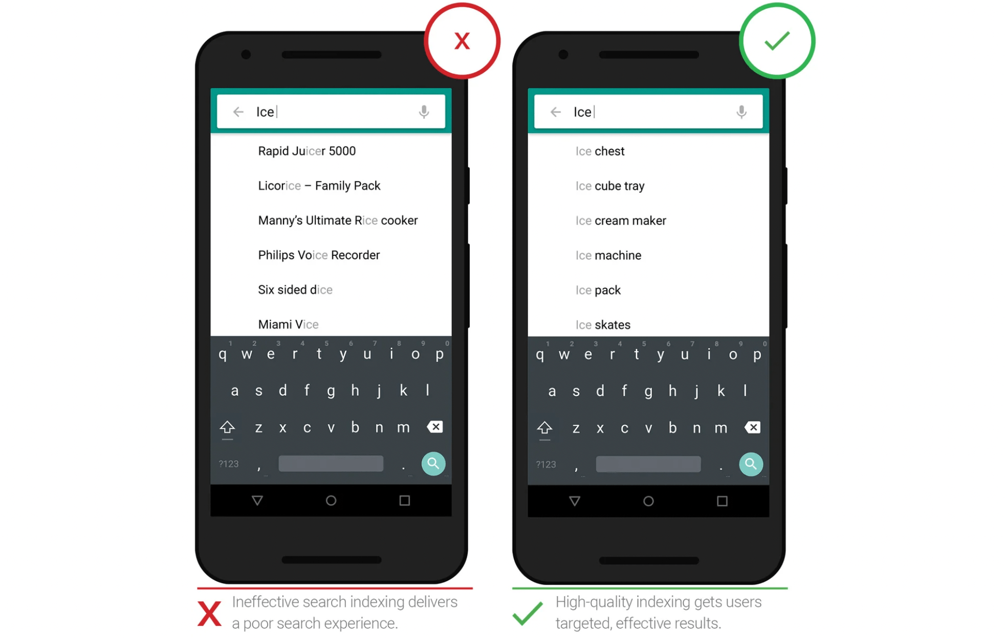
A great search experience happens when we help guide users when they’re typing their search queries, and ensure search results are useful, while also speeding up the search process. Handy functions like auto-suggestion, auto-correction, auto-completion, and root-word recognition incidence of user error while minimizing friction and keeping the user on your site. It seems simple enough, but it’s easy to get wrong. It all starts with good search indexing.

Image source: Google
Elasticsearch gives Altis additional capabilities to deliver relevant search results out of the box and takes WordPress beyond “exact match” phrasing, enabling the user to find what they need using vague search terms.
4. Use breadcrumbs
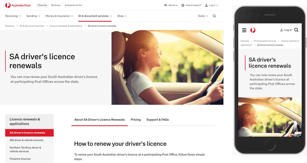
Breadcrumbs help users understand where they are in your website’s hierarchy. They’re the chain of page and section names you’ll usually find underneath the nav bar and are most often most useful for users that originate from search engine results and find themselves on your site without any orientation of your website. In the same sense as Hansel and Gretel’s literary breadcrumbs, users coming from Google will find themselves deep in the metaphorical woods of your website.

Australia Post’s user search experience leans heavily on breadcrumbs for reliable navigation.
By having a trail leading back to the home page through potentially relevant content in the same category, the user can immediately take small or large steps out of “the woods” in search of content in their interest, or choose to dive even deeper.
5. Let the user search by categories
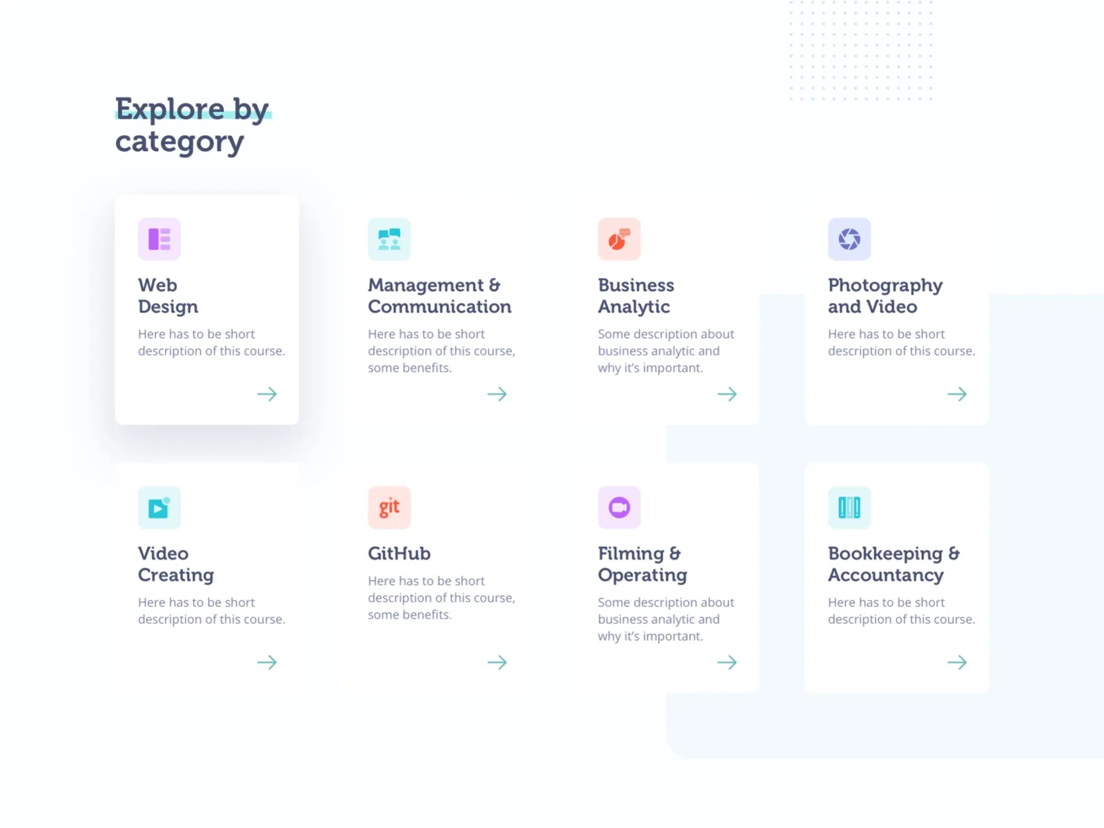
WordPress Categories are the core taxonomy of the CMS, useful for the administrative organisation of your content. To bring categories to the front end of your site for visitors, your developers can retrieve certain functions and display a list of your content categories in dropdown menus or as lists, providing more discovery options for the user.

Image credit: QU’ARTE Design
Place this feature where it makes the most sense for the user, like on a blog home page or incorporating it into your breadcrumbs.
Want to learn more about improving the search experience on your WordPress site? We’d be delighted to help.

